COLORING TUTORIAL WITH RICK AND MORTY!
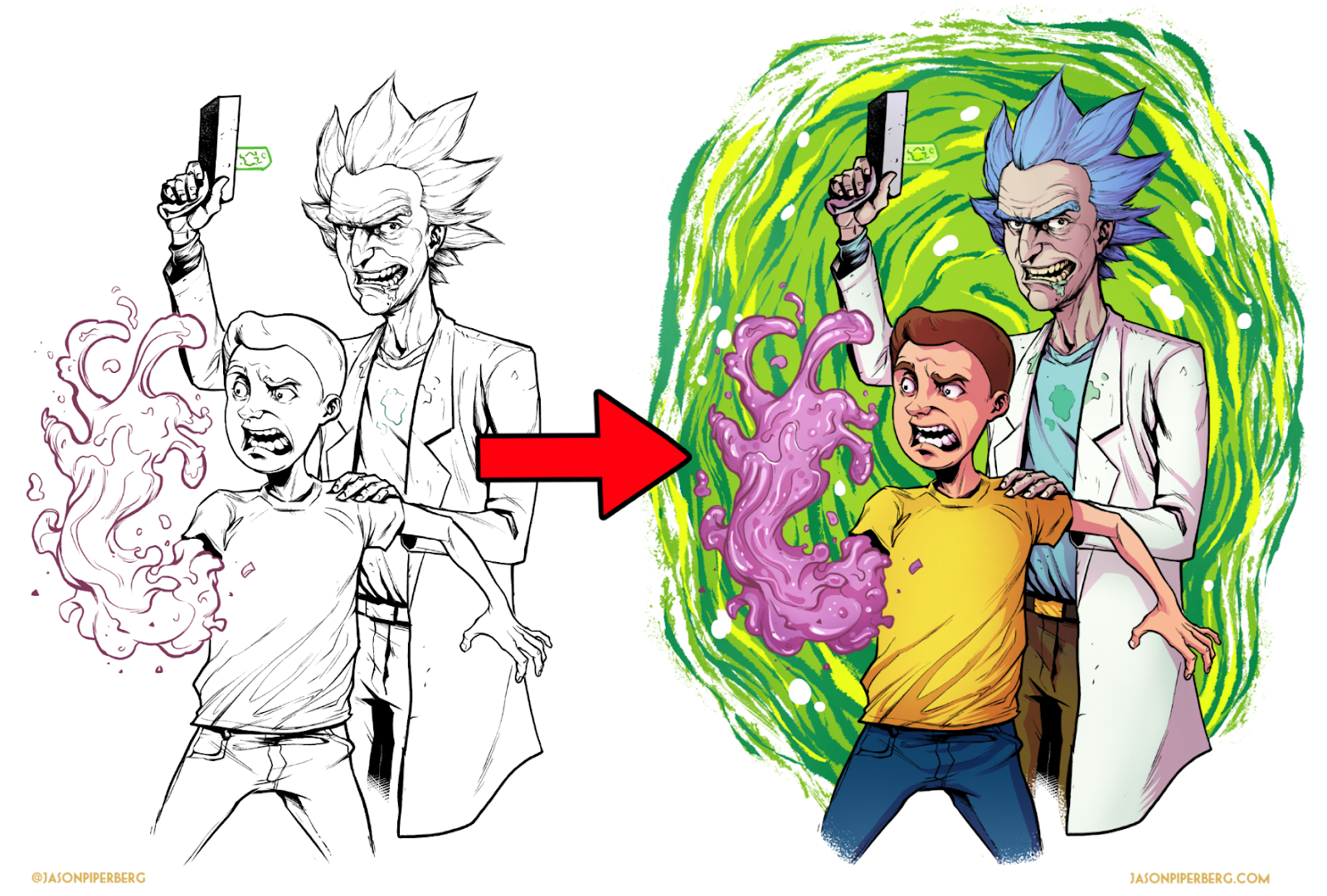
Coloring your artwork. Often one of the hardest parts about finishing a piece. Through the years I’ve had a lot of people compliment my colors, which is funny because when I was starting out I never wanted to learn color. Hell, I barely wanted to learn inking, but I learned both out of necessity and now they’re probably my favorite parts of image making! When I first tried my hand at coloring I was almost always over-complicating the process. So with this tutorial I want to give you the tools to somewhat streamline your coloring workflow, but always remember that this is just one way to do it. This isn’t a magic bullet and some images are going to require some different techniques.
Also, I’m not going to go over color theory, palette choices, how to pick shadow and highlight colors, etc. There are thousands of excellent tutorials online for those topics already by artists far better than me. If that’s something you need help with I strongly suggest things like Kurt Michael Russel’s Youtube channel. This tutorial is instead going to be more about breaking up your coloring into steps in order to keep you organized and on track while you’re coloring. I’m also gearing this tutorial toward those that have at least some level of proficiency with Clip Studio Paint, Photoshop, or whichever app you’re choosing to use. So I won’t be going over how to make selections of flat colors, or the more mechanical aspects of using a program like Clip Studio Paint.
I also want to give credit to artist, Paolo Rivera as his blog and videos were instrumental in helping me develop my spin on this process. (Rivera has actually informed a lot of my art process and his blog is a font of information that you should absolutely check out.) In many ways the coloring process I’m going to go over is a combination of his process and another artist with many videos on Youtube, Jonathan Rector.
Also many artists use Photoshop to color but I colored this piece in Clip Studio Paint; which my preferred app for digital art. That said, the steps I go over should be applicable to most other digital art programs as long as you have functionality for layers and layer modes like multiply.
I tend to color my work in a flatter, lower render style because it works well with the way I draw and lets the lines take center stage. But my hope is that even if this isn’t exactly the color style you’re going for, there may be something you can get out of this.
Alright, preamble over. Let’s get schwifty!
Basically, the key for me is splitting up all your stages of coloring into layers. This helps me move through the piece step by step rather than jumping around. Which in turn, helps with working each part of the piece equally. Once you finish a step you know you can move on to the next; and if needed go back and tweak at the end. The process is as follows and I’ll go over each step. For each of these steps you’ll add at least one new layer to your piece/file.
- Flat color
- Gradients
- Shadows (sometimes I actually do this in my inking stage. I’ll explain later)
- Highlights
- Spot highlights (not always needed)
- Effects (Glow, textures, Colored line art, etc.) This piece doesn’t really have any, but I’m bringing this up to show when in my process it is.
1. FLAT COLOR:
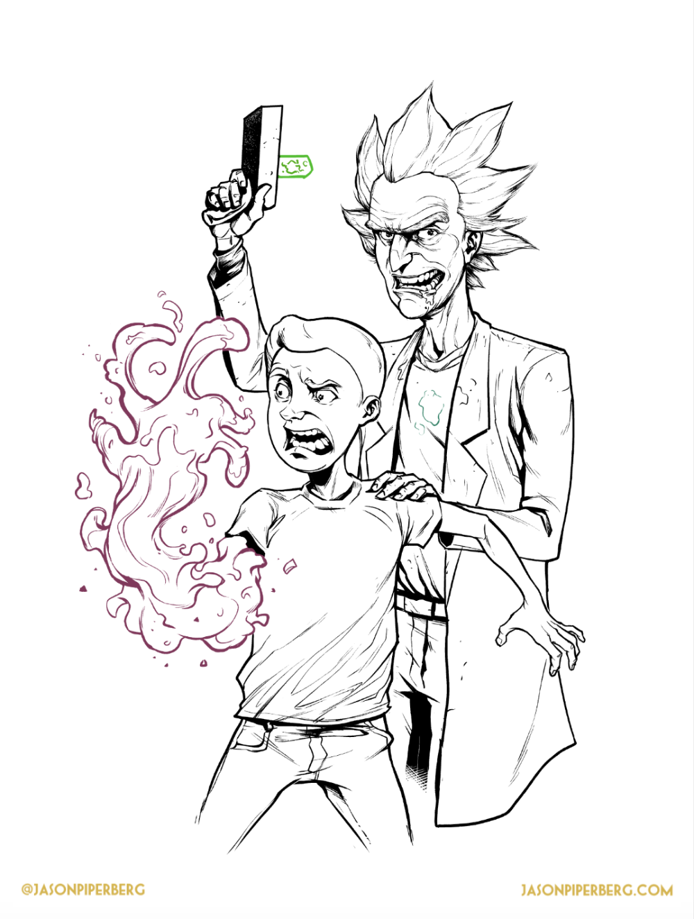
So you have your line art. In mine I eventually colored some of the lines, as you can see, but when I started all lines were black.
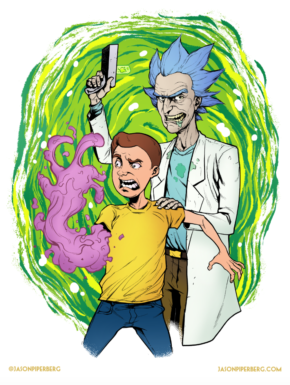
Step one is to fill in your lines with only flat color. You’re not doing any rendering, only picking the base colors. Remember to flat color the whole image before you do any rendering. That goes for all of these steps. Take it one whole step at a time. Don’t try to jump ahead to more rendering on one area if you haven’t flatted the whole image. Here are the flat colors:
2. GRADIENTS:
Flats can be boring but they’re necessary as they make future selections very easy! So the next step is to duplicate that flats layer. You want to maintain the flats for selection purposes as you move forward. it’ll make coloring, texturing, etc. much easier and more efficient. That duplicate layer is where you add your gradients. In this step you’re going to use the magic wand tool to select each flat color block and with either a gradient tool or a soft airbrush add in some color gradations. Nothing too extreme, but this will add some needed tone that adds a bit more volume to the forms.
If you’re going for more of a flat color style you might even be able to stop here, but if you want a bit more defined lighting this next stage is important.
3. SHADOWS:
Make a new layer for your shadows. This will make the shadows an editable layer on their own which means you can sculpt them without messing with the earlier steps. There are lots of ways to do this. I used to manually pick out all of my shadow colors for each surface (shirt, hair, skin, etc.), which can look great but take a long time. Now though, I often set the shadow layer to Multiply and pick a de-saturated color. Doing this means the color I choose will naturally “blend” into the color under it. Which, along with being easier to do, also adds more cohesion to your palette because all the shadows will be the same temperature and value; since you’re only using the one color for your shadows.
For this it was a darker purple. Also credit where it’s due, I first saw this technique from fellow comic artist Jonathan Rector on several of his youtube videos.
Here’s what the shadow layer looks like when it’s set to “Normal” rather than “Multiply”. Gross, right? Layer modes do wonders. Maybe you have a different one you think looks better than multiply. If so, use it!
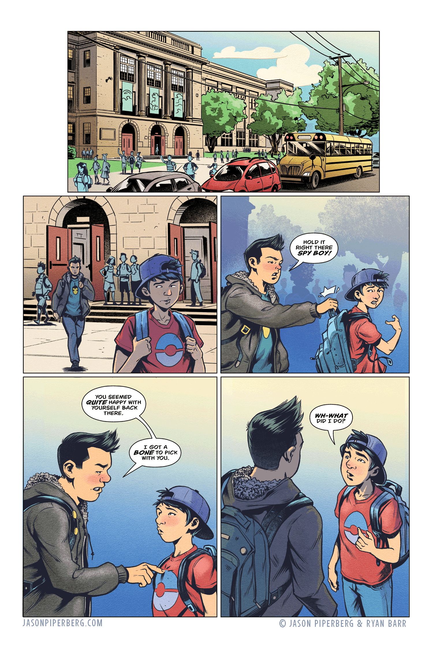
Many times, especially if I’m not coloring my own art, I’ll actually do this in grey tones during my inking and leave that layer separate when I send the art over to my colorist. This makes they’re job a bit easier because they can take that grey tone layer, and colorize it. Below is an example of what I mean. This page is from one of my recent comics, Patriot Tales 3. It’s colored by Ryan Barr, go follow him!
4. HIGHLIGHTS:
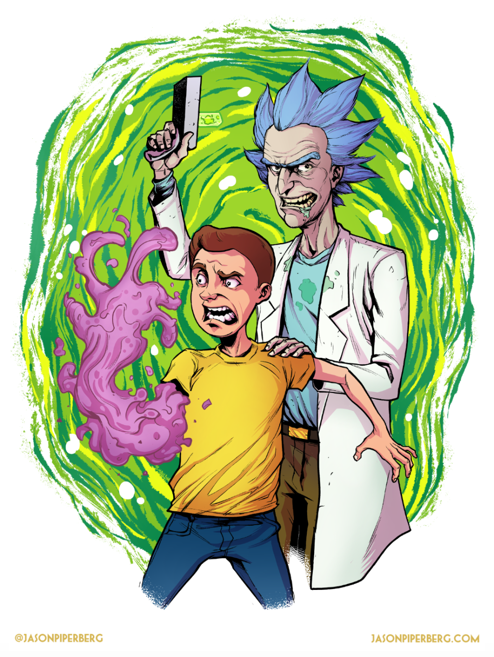
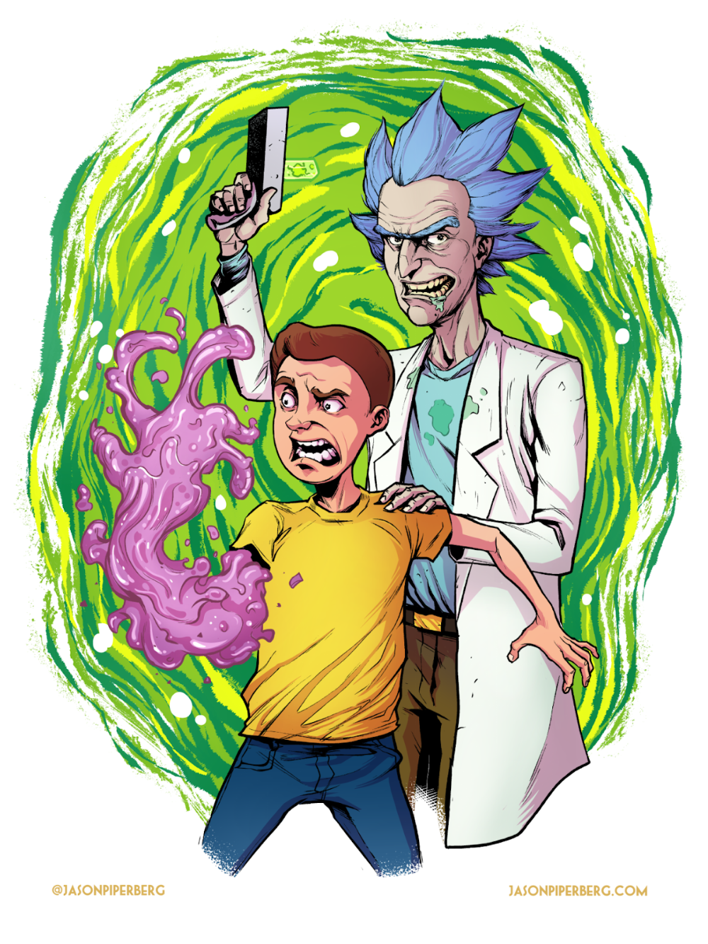
Next is the Highlights which for this piece I mainly just added on to Morty’s weird arm. Isolating it to that made the arm look more shiny than the rest of the image and I wanted to give that contrast. The highlights are on their own layer.
One thing to note is that on the highlights layer, I added a slight gradient to them. They’re a bit darker on the base of his arm and get lighter the closer we get to Morty’s “goo fingers”.
5. SPOT HIGHLIGHTS:
I then added one more layer for spot highlights on Morty’s weird arm. These are just a few spots of pure white.





0 Comments