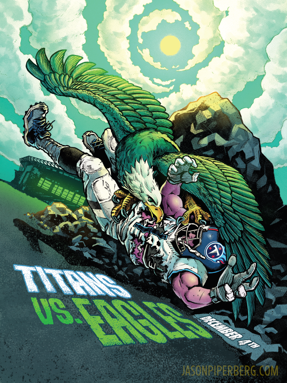
EAGLES GAME DAY POSTER: ART PROCESS
Full disclosure, I’m not a big football or sports fan. However, I love Philadelphia, and if I had a team, the Eagles would be it. That being said, I do enjoy mythology, so the fact that I was assigned the poster for Eagles’ game against the Tennessee Titans, was a good match for my sensibilities! I wish I could take full credit for the way this came together, but my art director for this poster is the one who proposed the idea of utilizing the Prometheus myth, and then suggested an homage of the painting ‘Prometeus Bound’ by Peter Paul Rubens, which hangs in the Philadelphia Museum of Art.
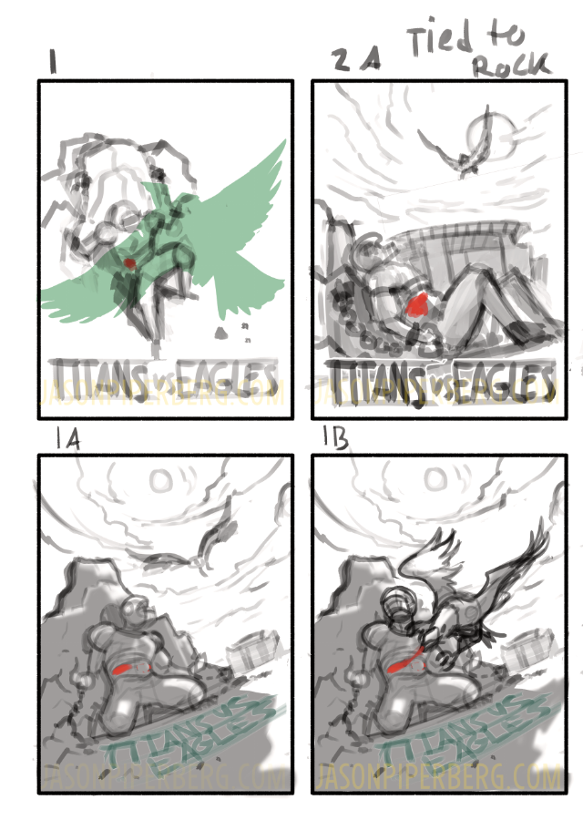
So, how did this project start? First, with some thumbnails like always.
Thumbnails: This was my first set of thumbnails, or rough layout sketches. As you can see the main idea is still present, and although I still like some of these, I’m glad that we kept pushing for something a bit stronger.
The winning thumbnail: After pushing a bit more and drawing inspiration (no pun intended) from the Peter Paul Rubens painting ‘Prometheus Bound’ I landed on this. It was approved and I moved onto the next stage, the tight sketch.
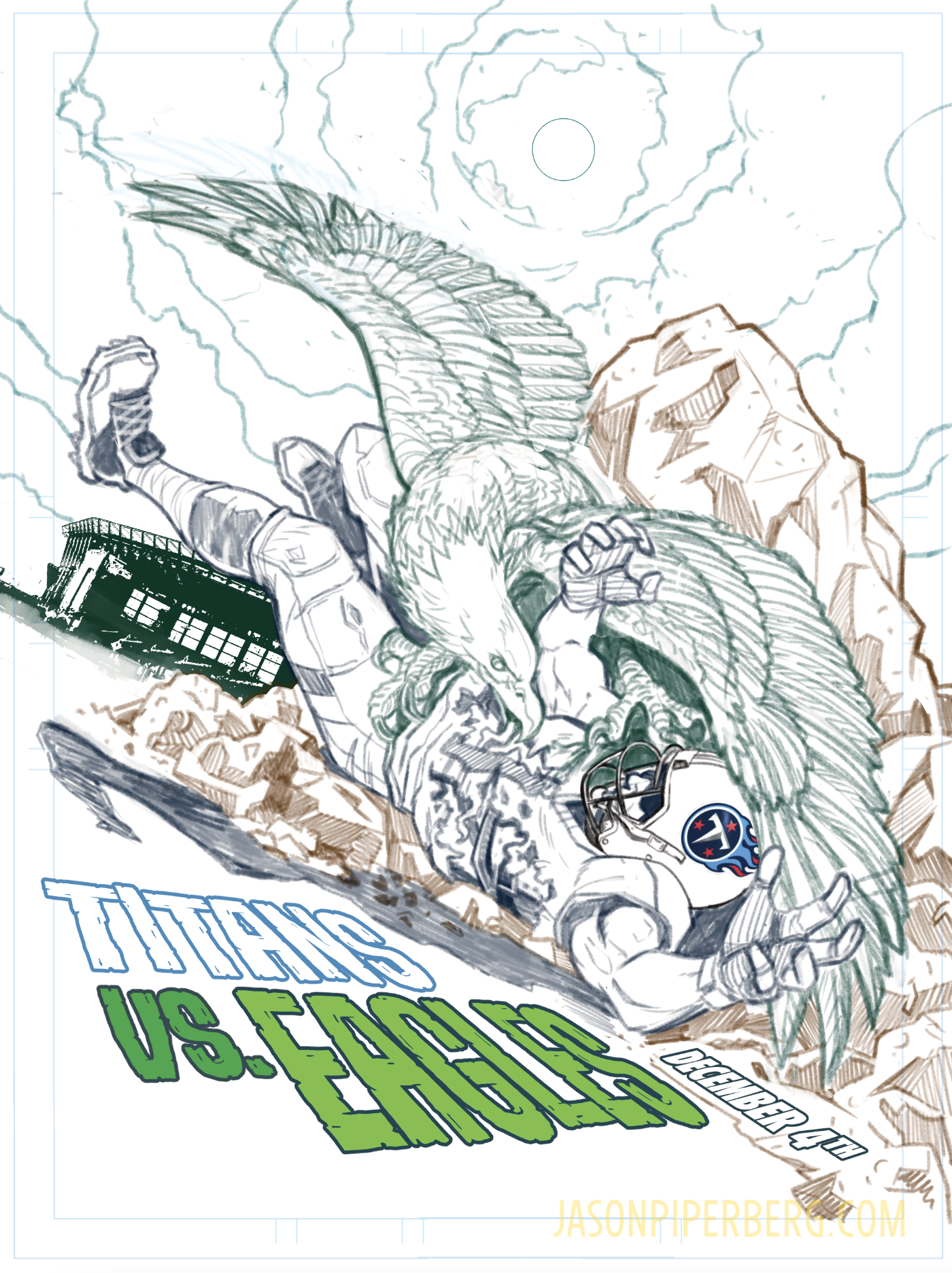
Tight Sketch: This was the stage where I refined the anatomy and set up the typography. I like using different colors for my sketch lines to keep elements a bit more visually organized. It helps me make sure I’m drawing on the right layer.
If you look carefully at the Eagle’s top wing (left side) you’ll see that it’s a bit different than in the “winning thumbnail”, which was closer to the Rubens painting. That wing proved difficult to get right, I had to re-draw it 15 or 20 times before the poster was finished. I’m not sure anyone but me would have noticed or cared, but it would have bugged me.
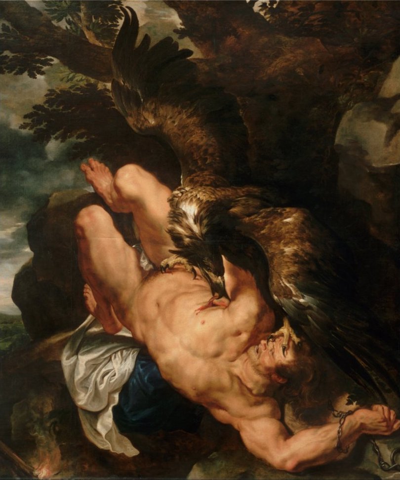
Speaking of Rubens, I should probably show that here for anyone unfamiliar with that painting.
Prometheus Bound – Peter Paul Rubens
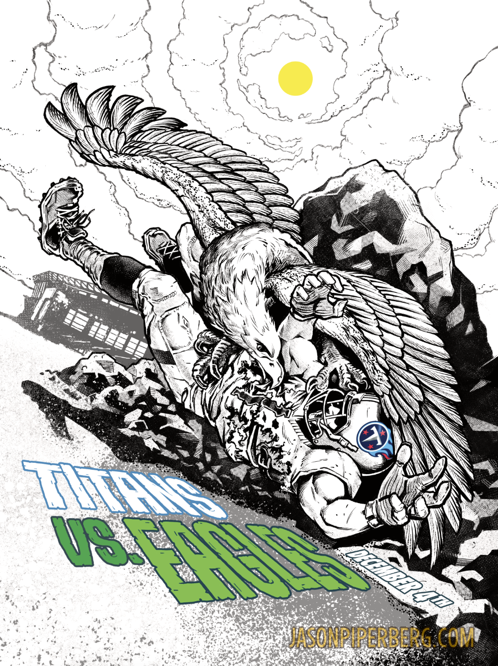
Inks: Inking is often my favorite stage in an illustration, and this one was no different. I love adding in the textural elements, and seeing the peice solidify. Inking is usually pretty meditative for me. My favorite areas are probably the way the lower wing (right side) turned out, and I like the way the clouds turned out on this. After this was approved, I was ready to move onto color!
Final Colored Art
It took a little time to land on a color palette that worked but going with green was clearly the right choice. I mean it is an Eagles poster, why not lean into it, right?
All in all I’m happy with the way this turned out and based on some of the reactions I’ve seen so far, it seems that people are really connecting with it, which is the best I could hope for. I’m also thrilled that the Eagles one their game 35 – 10. It would have been a little awkward to do a poster like this and then have them fumble the win.

