Tutorial: Making a great Paper texture in Clip Studio Paint
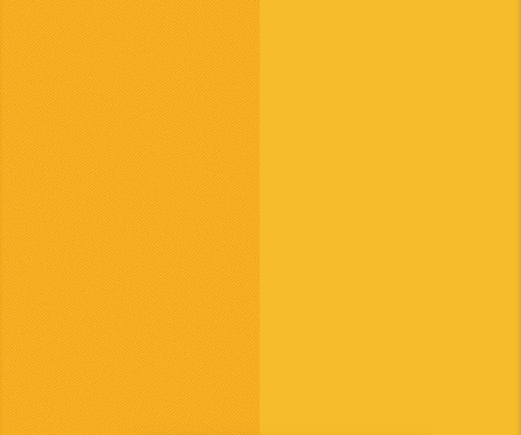
Texture overlay on the left. Flat color on the right.
So you’ve made a great illustration in Clip Studio Paint or Photoshop. Your line work (if you’re a line artist) is the way you want it, you have an eye catching color palette, your composition is dynamic, but there’s something about it that still feels just a little off. It feels a little too, well, “digital”. If you do artwork digitally, or color scans of your traditional art and digitally color them, you may have run into this. Working digitally is fantastic for so many reasons but it can sometimes result in your art lacking the tooth of traditional artwork.
There are of course a variety of ways to remedy this. If you have a more painterly style you can use textured brushes, from brush makers like Kyle T. Webster, Ray Frenden, Paolo Limoncelli (DAUB Brushes), Brian Allen, and many others. There’s also the grain filter effect that you can apply in Photoshop (Comic artist Paolo Rivera mentions how he does this in his Comic Book Coloring Tutorial.) All of these methods are totally valid and I’ve used all of them at one time or another. Recently though, I discovered a fairly simple way to create a really fun paper texture (seen above) to add over your work.
Note: This tutorial is geared toward users of Clip Studio Paint (Manga Studio 5) but is possible in Photoshop and similar programs that have layer modes. I’ve provided a dropbox link at the end of this post to a .psd that contains layers which will allow you to replicate this in Photoshop to some degree.
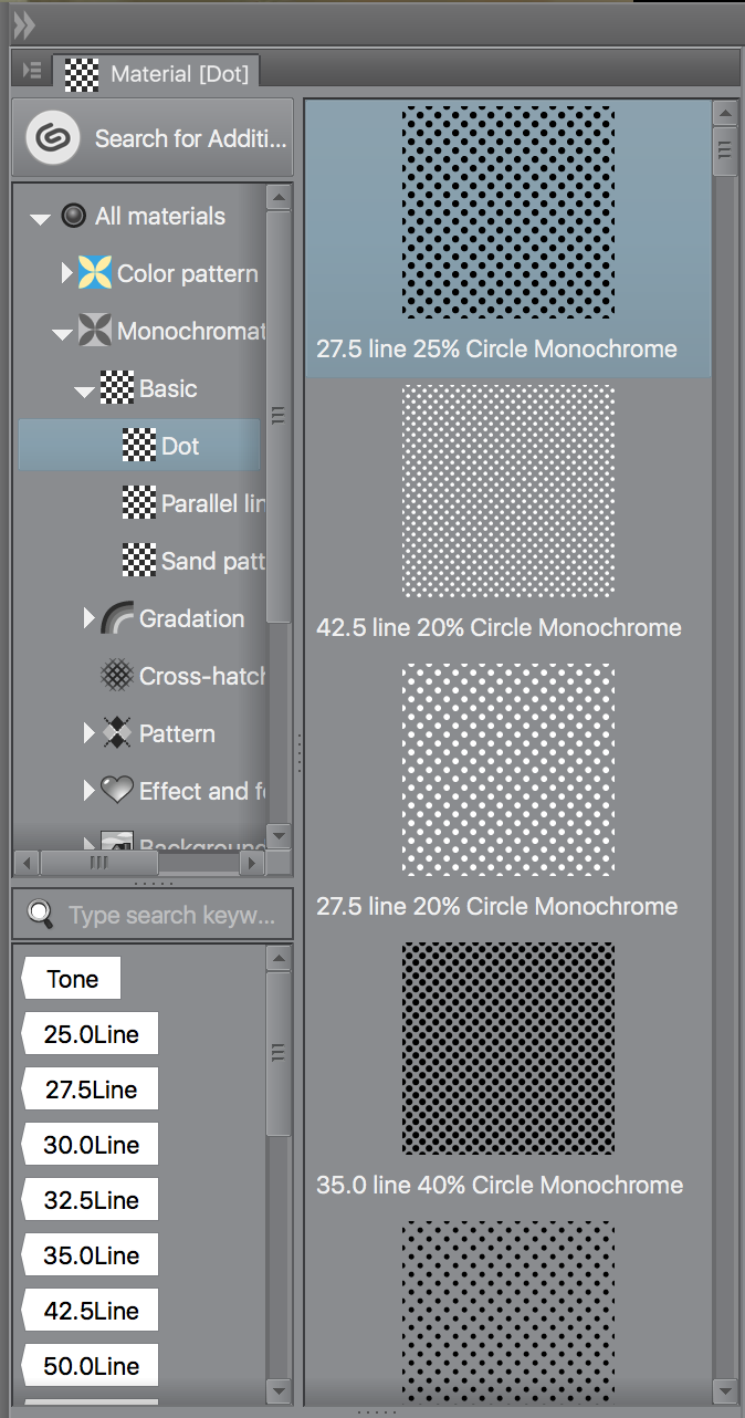
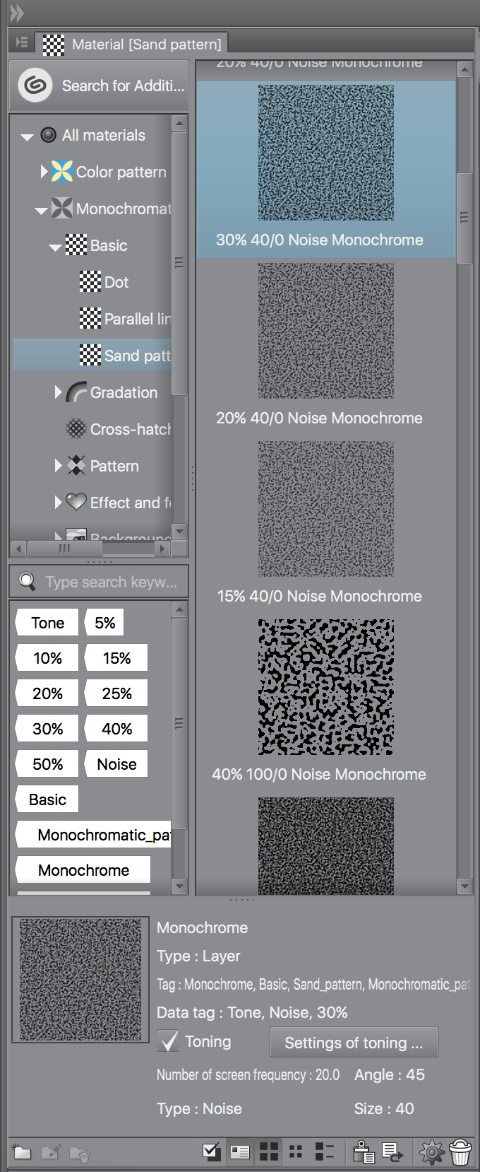
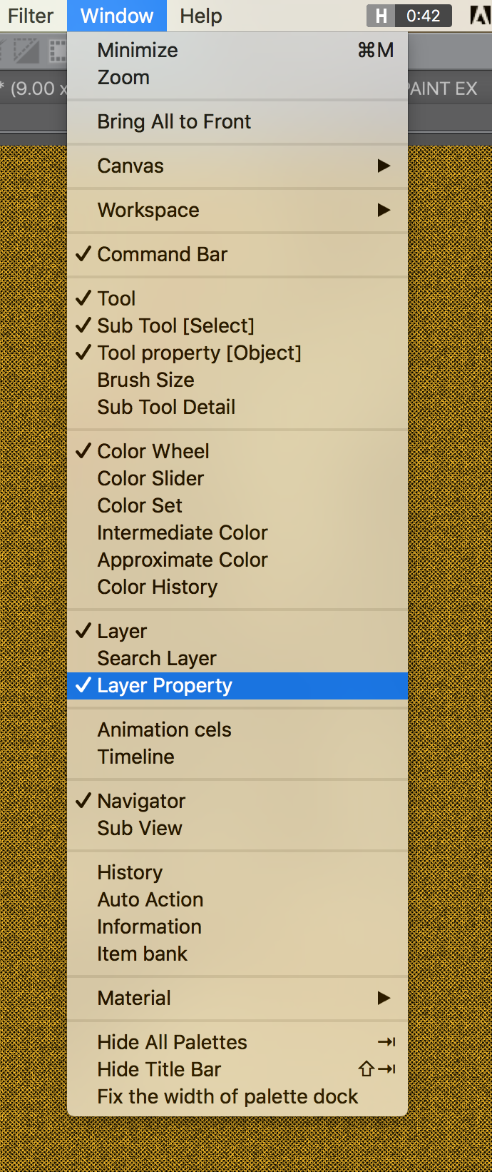
So how do we create the texture overlay pictured above? In Clip Studio Paint there is something called the Materials Palette. The materials we need are in the Dot and Sand Pattern palette’s in the Basic Materials palette. If you don’t know where those are you can find them by going to Window>Materials>Basic
Presumably you have your file open at this point. If not, do that if you want to follow along.
I advise choosing the circle patterns. Black dots are probably more useful for this tutorial.
Once you’ve selected a dot pattern you like click and drag it over and on to your image canvas.
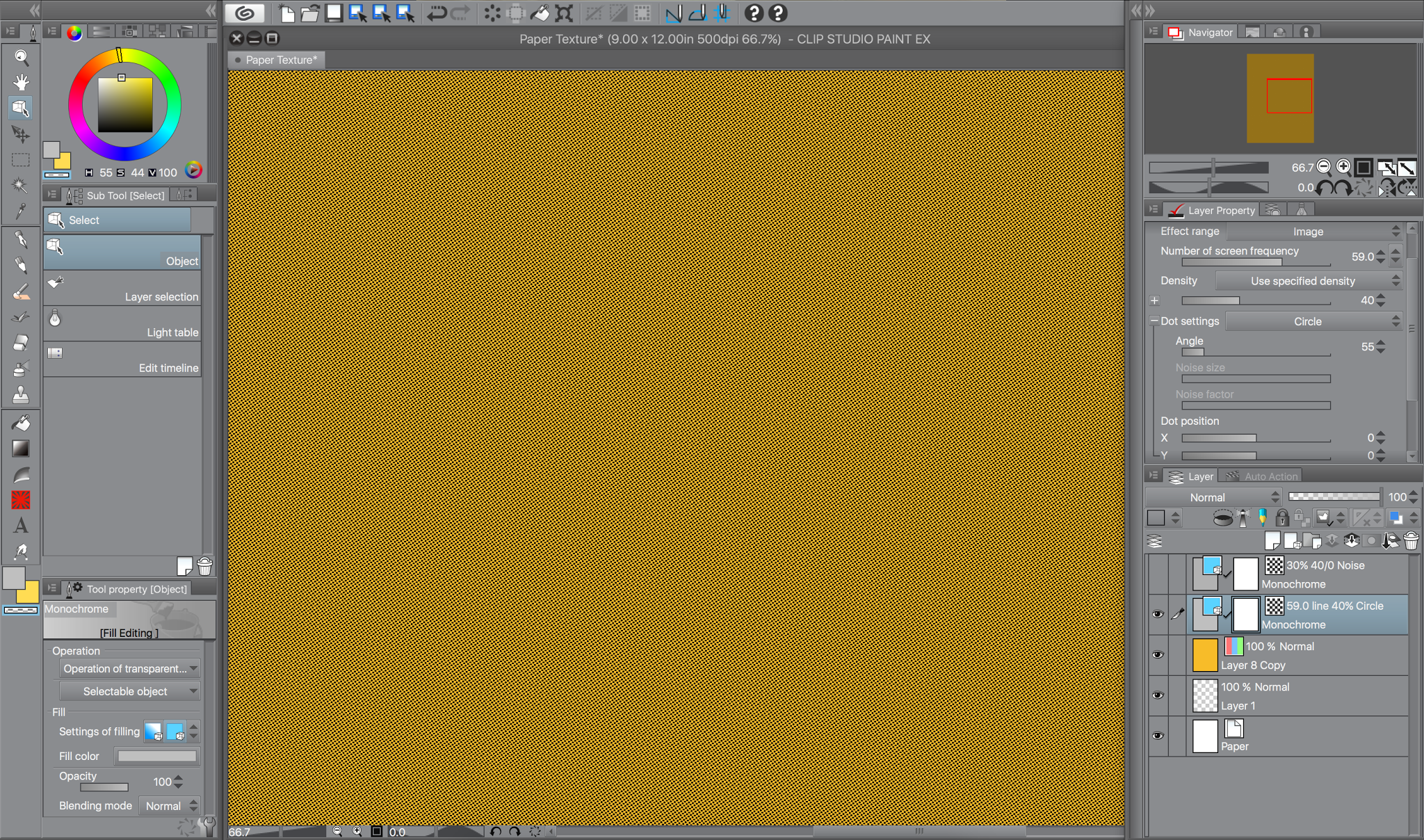
Once you’ve dropped the dots into your canvas you should see something similar to the image below. If you’re working over an illustration and not a flat color like me you’ll obviously see the dots over your image.
Next we will replicate this step but instead of dots we’ll be dragging in a noise screen over top of our halftone dots. You can find it in the Sand Pattern sub menu in the Basic palette.
Now you’ve hopefully got something like this on your canvas.
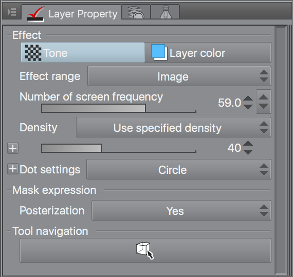
As stated before we’ll be adjusting the Number of Screen Frequency and the Density sliders. The higher you set these numbers the smaller and more compact the dots will appear. This is honestly more of a preference thing and it depends on the image. Sometimes you’ll want bigger dots, sometimes smaller dots. Do what looks good for your piece.
For this example I’ve set the Screen Frequency for my Dots layer to 59 and my density to 40. There’s no particular science to this, it’s just what looked good to me.
This creates pretty small dots that are fairly close together. If you zoom in and turn off visibility for your noise layer, it should look like this.
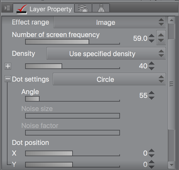
Next open the Dot settings sub menu in the Layer Property palette and set the angle to 55.
Now the dots are on more of a diagonal. This prevents some of the “tiling” you may have seen on the canvas screen shot above. This makes the texture a bit more organic looking.
Select your noise layer and turn it’s visibility back on. In the Layer Property palette set it’s density to 40.
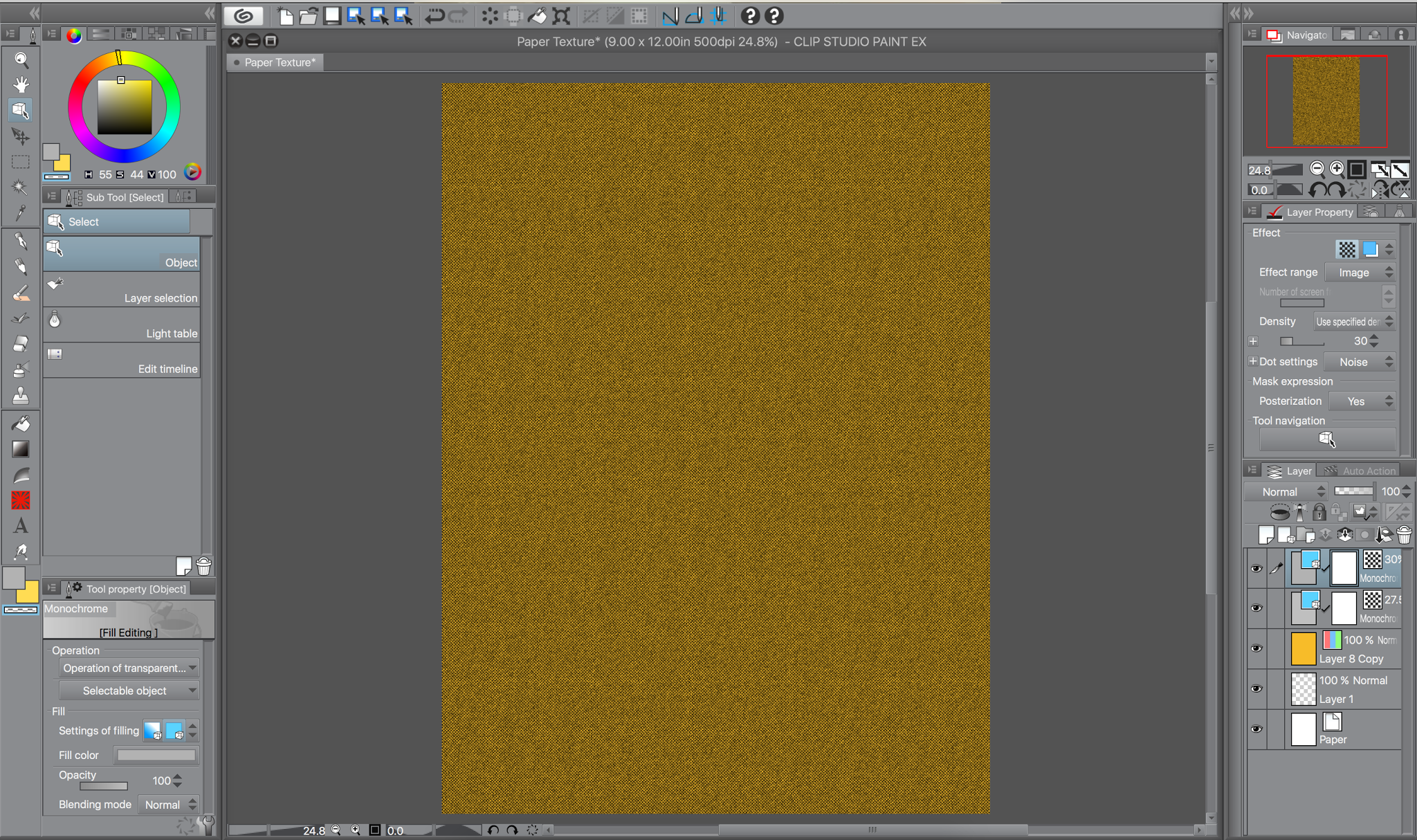
Now it should look like this.
So orange!
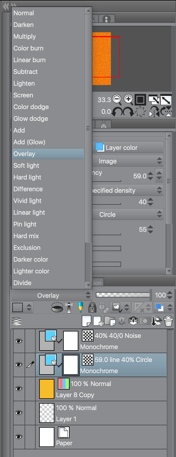
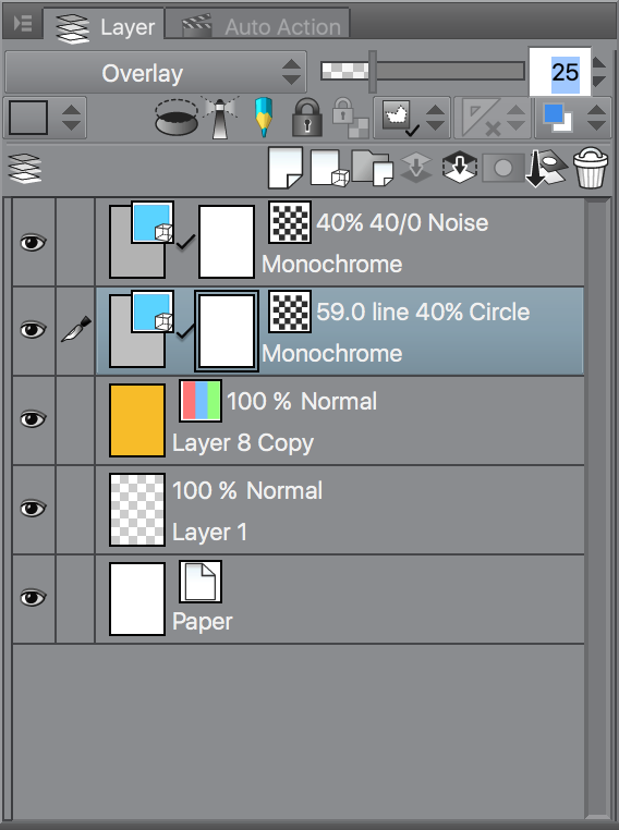
Once we’ve done this, the black dots on our Dot and Noise layers will pick up the color of the layer(s) below them. It works well for what we’re doing but as you can see it has turned our yellow into an orange. We do want to see the texture, just not that much. So next we’ll lower the opacity of both of our screen layers. You can choose whatever looks good on your image, but for this I set my Noise Screen opacity to 30% and my dot Screen to 25% opacity.
In case you don’t know where the Opacity slider is.
That’s better.
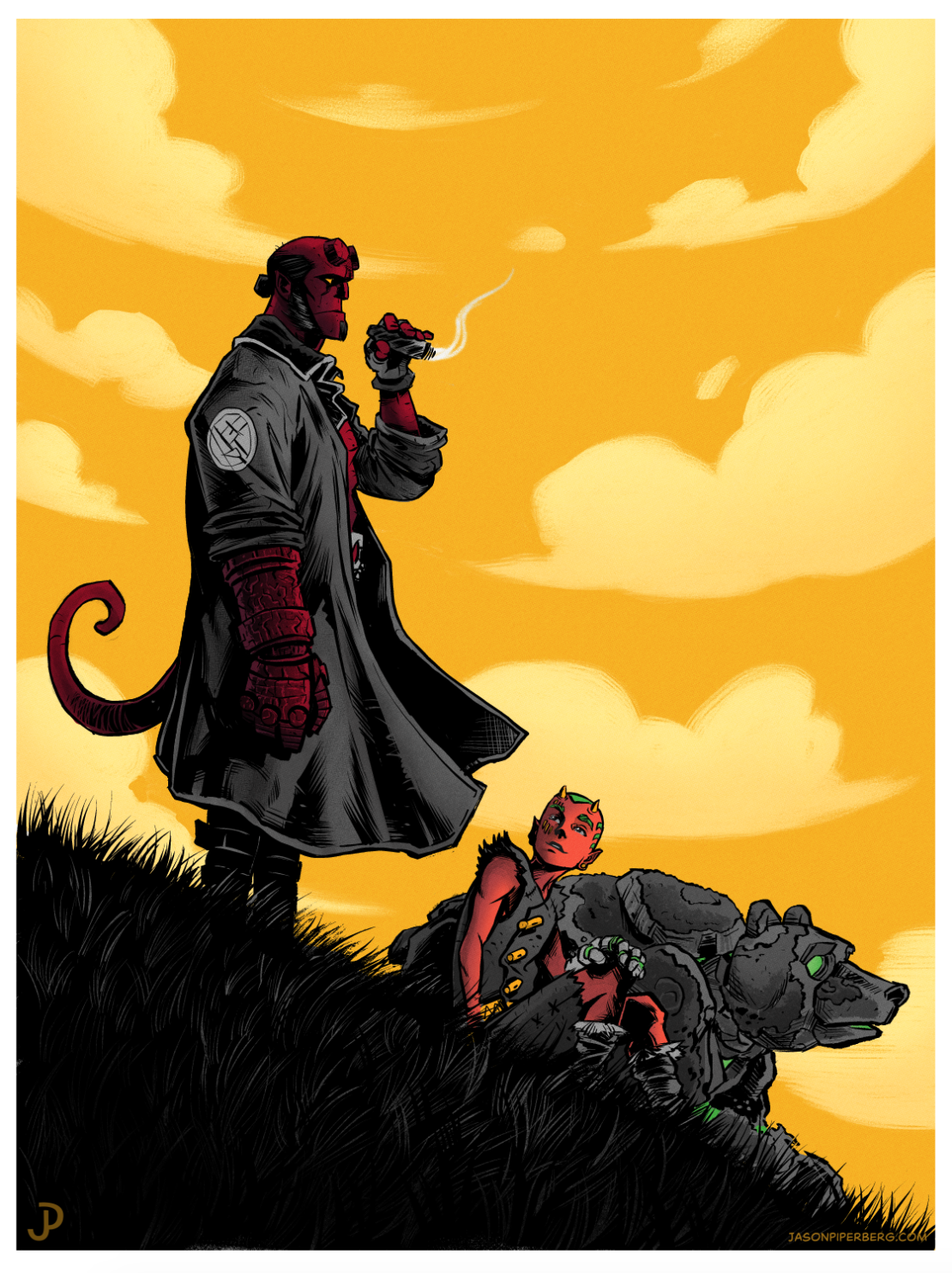
There you go! A fun paper texture overlay to add a little traditional feel to your digital work. If you’re curious what it looks like over some art and not just a layer of flat color, here’s a recent piece that I added this texture to. A fan art piece of Hellboy and Kaoru & Kuma; characters from Champions of Hara which I helped create!
Hellboy, Kaoru and Kuma. Done in Clip Studio Paint EX. Brushes and pen tools from Frenden, Daub, Brian Allen, and Robert Marzullo.
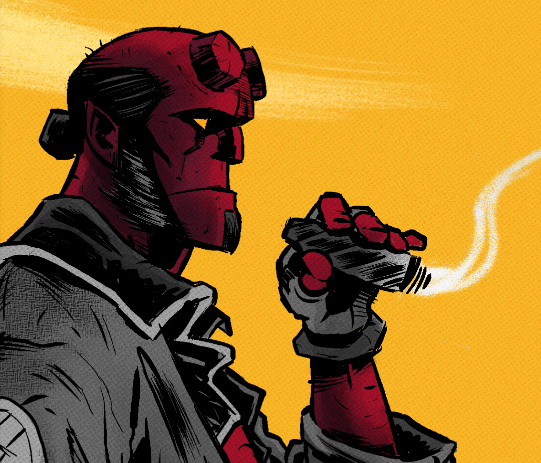
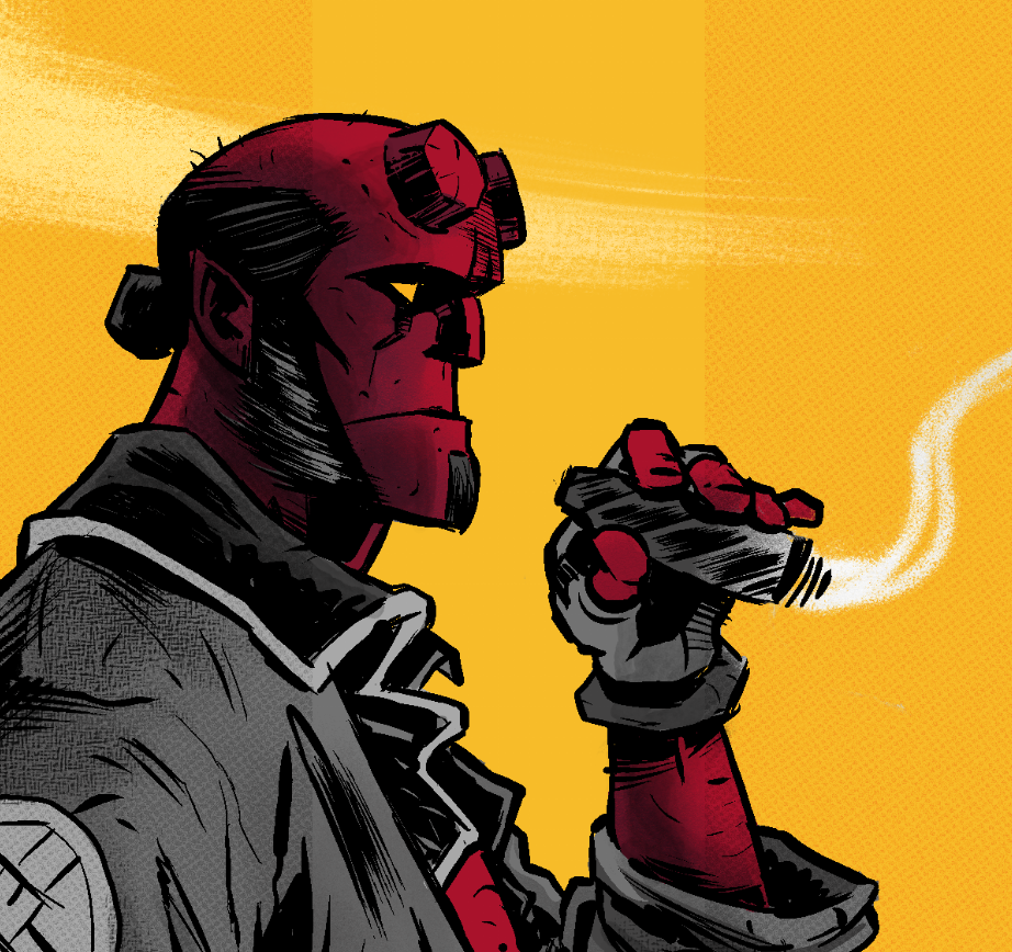
Now the texture is there but still subtle enough that it won’t greatly distort your color palette. It may seem almost too subtle in the above screen shot. But look at the image below. I’ve masked out a section so you can more clearly see the texture.
Close up on Hellboy’s beautiful Mug for detail.
Texture masked out in the center.


